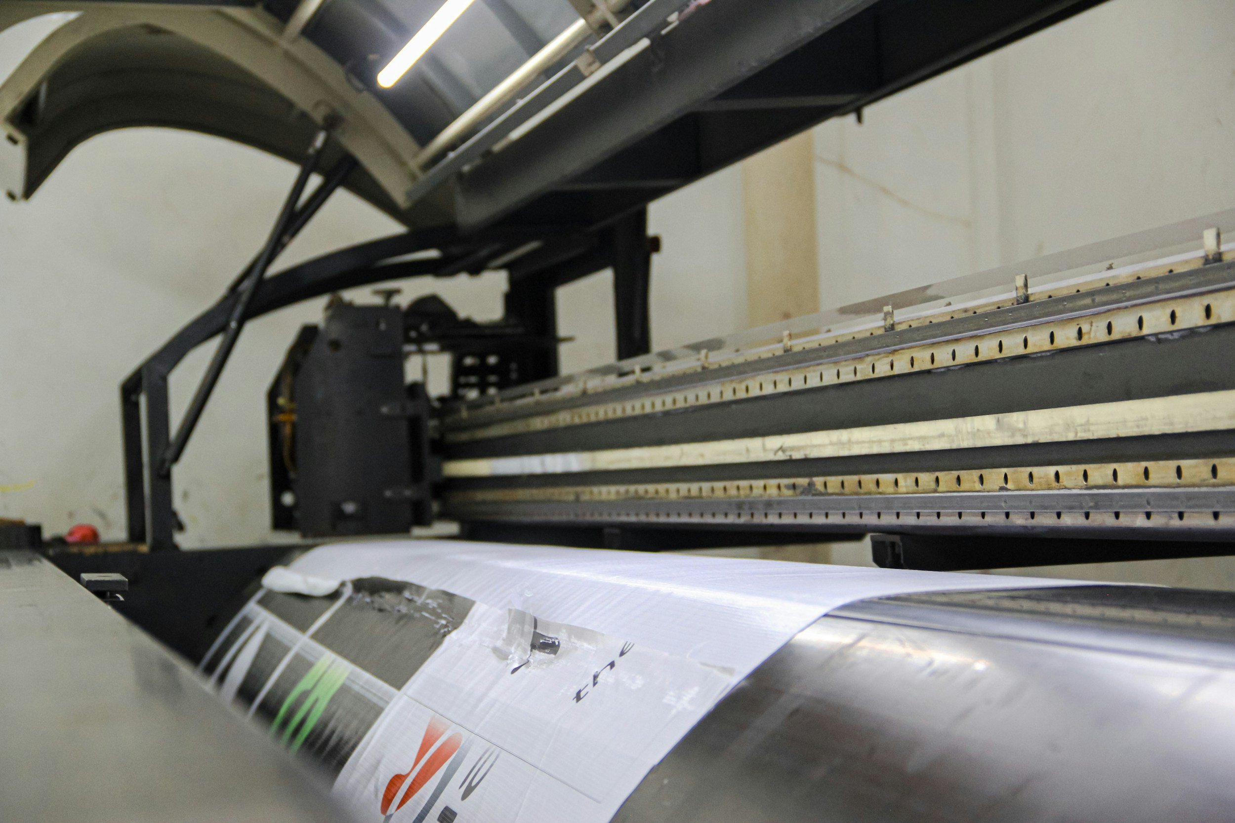
When designing for print and digital graphics, getting the file preparation right is an absolute must. Each medium has its own requirements, and understanding those differences is important to making your final work come out as pristine as possible.
print design
The first thing I always do is set the files to CMYK color mode because that’s what printers work with. If you leave your files in RGB, you might end up with colors that look completely different once they’re printed. I also make sure the resolution is set to 300 DPI so everything is sharp and clear. Anything less, and your design could come out looking fuzzy or pixelated, which looks super unprofessional.
Another thing to keep in mind with print is setting up margins and bleeds. Margins ensure that important elements don’t get too close to the edge, so nothing gets cut off, while bleeds allow for any slight shifts during printing. Without these, your design might look great on screen but could be a mess when printed. It’s those little details that really make a difference in the final piece.
Digital design
I prepare my files in RGB color mode because that’s how screens display color. The resolution doesn’t need to be as high as in print. Usually 72 DPI does the trick since screens don’t need as many pixels to look good. Plus, keeping the file size down is extremely important for making sure websites and social media pages load quickly. Your audience will rarely wait around for a slow page to load.
You’ve got to think about responsiveness too. I make sure my designs are adapting to different screen sizes, whether it’s a desktop, tablet, or smartphone. In our world today, where everyone’s using so many different devices, having a design that looks good everywhere is not only a consideration but a necessity. Whether I’m working on logos, websites, or social media graphics, knowing how to prep files properly for each subject is needed for delivering results that impress clients. Paying attention to these details ensures that the final product looks professional, consistent, and impactful, no matter where it’s seen.